
The Verge launches radical redesign
One of the biggest publications in tech, The Verge, has launched a huge redesign. The new design replaces the iconic The Verge wordmark…

One of the biggest publications in tech, The Verge, has launched a huge redesign. The new design replaces the iconic The Verge wordmark, the penrose triangle Verge icon and the hierarchy and design of the website.


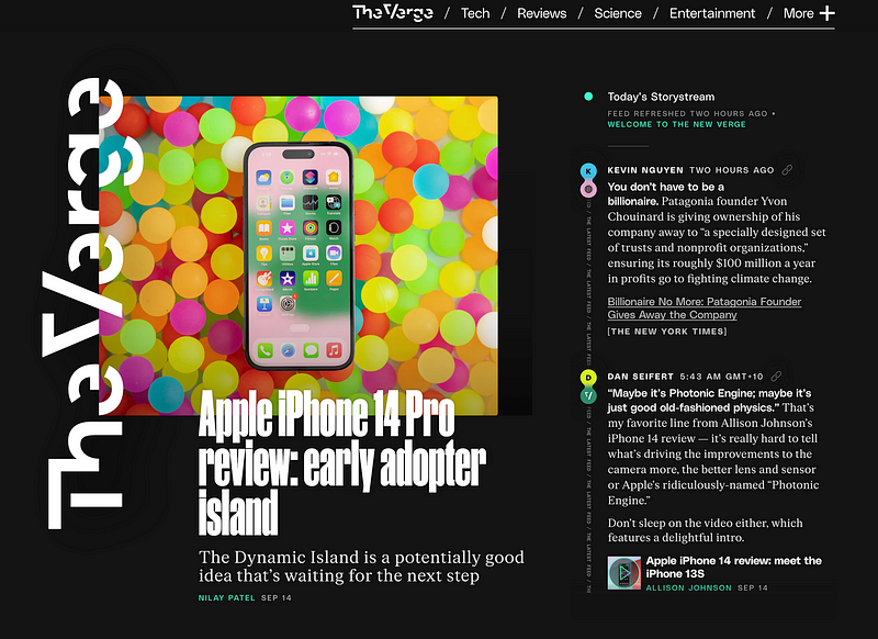
In an even more radical move, the homepage of the website now features an updating Storystream alongside more traditional posts, featuring liveblog-style links to external articles and smaller news items.
In a podcast about the redesign, Editor In Chief Nilay Patel described the idea behind the new post format as being akin to Twitter, and that he and former editor Dieter Bohn wanted to be able to Tweet directly onto the homepage. Creating outbound traffic for other publications is also part of the liveblog approach, with a possible attempt to be more like Techmeme or Daring Fireball in terms of aggregation. Though original content will also absolutely remain, and is still the more prominent part of the site.
Overall I think the new design is great. People hate every single redesign of anything, but I think The Verge’s new homepage is how a modern publication should compete with the likes of Twitter. Similar to Australia’s Sydney Morning Herald, which often has a liveblog on the homepage featuring breaking news from throughout the day, this new approach means you can capture more realtime information. It also means the homepage is less of a Google or Apple News style RSS aggregator of articles and has more life and a reason to exist. I assume during events like Apple’s recent iPhone 14 announcement, this will make the homepage more of a destination, rather than just linking off to a liveblog that’s detailing news snippets.
The criticism also reminds me of the reaction to the original Verge design, and even the more recent 2016 redesign. If you can find me a website or app redesign that has positive feedback I’d love to see it, because otherwise I just now assume that all feedback to any design changes will be negative. It’s fun to throw around phrases like ‘the UX is bad”, but what specifically is wrong with new design? I think most of the changes are resoundingly positive and daring.

The new logo is a bit of a step backwards personally, but at 10 years old maybe The Verge needed the refresh. The iconic penrose triangle will be missed.
And as people are likely to forget, the original 2011 wordmark was similarly criticised anyway, with Under Consideration saying that “Herb Lubalin Called, he wants his Typography Back”. The poll at the end of their 2016 article and their 2022 article claims that the designs are “bad”. But people still read The Verge, and they still claim that this new design is somehow a step backwards.
An article today furthered that original review, saying “The old logo was fine… I don’t think I ever really liked-liked their 1960s typography approach but, to their credit, it was a precursor to the Stranger Things logo that kicked off a trend in that style and that perhaps could not have been possible without The Verge having set a precedent but that’s just speculation. Point being, for a web publication chronicling the evolution of modern-day technology and the quickly-evolving web landscape it was a highly anachronistic logo to keep carrying around, especially as the irony of an old-timey aesthetic wore off.”
Some of the font work on the new site is questionable, mainly these vertical text areas. While there is a smaller header that says PODCASTS, the vertical text is quite hard to read at a glance, and works better as a headline font as opposed to a defined background title.

But the way this font works as a headline, especially with the blue hover state, is very nice:

And I love that vertical and weird logos are in right now. It does remind me of the new Gawker, which former editor Joshua Topolsky now works on (along with other sites at Bustle Digital Group).


I think it’s a step in the right direction. And if websites are to actually compete with the homogenous directives of Google and Apple News, or Facebook Instant Articles (I don’t know if they’re still a thing), they need to offer some new ideas. And this redesign is full of them.

